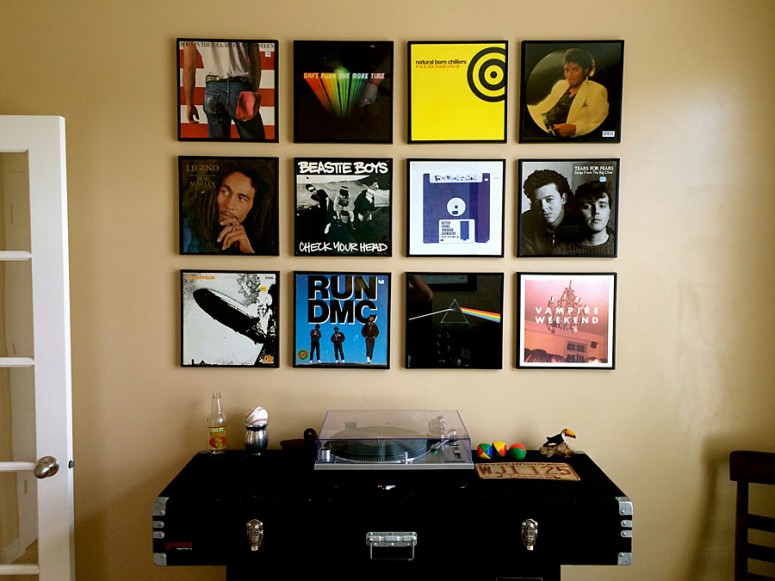
Should have known: Visually straight not the same as mathematically straight

Photo: Blake Snow
For anyone with an intermediate understanding of graphic design, you’ll know that some shapes look better when visually centered as opposed to mathematically centered. I thought that truth would hold up over the weekend while hanging square records on my office wall. It didn’t.
As eagle-eyed readers will notice, the right side of the montage is a fourth of an inch lower than the left. I had my pencil, level, helpmeet (Hi, Lindsey!) and string handy, thinking I could crack this nut in minutes. An hour later, and while cursing my inability to recall basic geometric calculations, I thought to myself, “If I can keep it visually aligned, I’m sure it’ll look okay.”
By the time I finished, it was mathematically obvious: My estimation was wrong. Having already invested upwards of two hours on the job, and with the kids asking for the umpteenth time if we were “leaving for the pool yet?”, I hastily skewed some right side records to minimize the visual damage. In doing so, I messed up the two inch margins in between prints.
Although I once excelled at math in school, it’s a good thing I never became an engineer.
