Want to encourage better conversion rates on your website (be it purchases, blog traffic, whatever) while looking good? Don’t give your readers more than a few options to choose from. By forcing them to look at what you want, you’ll enjoy more targeted traffic.
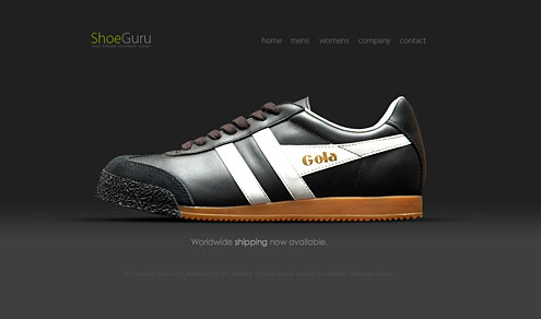
Apple does it. So does Shoe Guru. Both may be extreme, but their website design ensures them greater control over what they promote, resulting in tighter focus and better sales over the alternative, cluttered sites.
Off-topic: I’d totally buy those shoes if knew what Shoe Guru size I wear.
[youtube]http://www.youtube.com/watch?v=kU9YeOQm3Y0[/youtube]
From this video we learn two things:
- (Most) People are terrible designers
- (Most) Designers have no balls. Rather, they collectively pander to client requests instead of imposing their professional will on customers much like a doctor or mechanic would. This is a disservice to both the client and the designer — everybody loses.
[via Nick Roussos]

I’m actually okay with airbrushing from a design standpoint — to an extent. So long as you “clean up” blemishes, I’m fine with it. But I also believe mainstream designers have gone too far recently, especially when they start digitally thinning tubby individuals or make humans look more like plasticized wax than a living organism. The above photo illustration, by Jill Greenberg, is brilliant in its subject (to candidly capture toddlers crying), but her Photoshop hack job looks disturbingly awkward. Can we at least spare the children? This picture would have been so much better unadulterated.
