You can’t tell by just looking at it. But click the above screen capture for what I consider the most elegant web behavior I’ve seen in a decade.
I call it scripted scrolling, and it makes scrolling more experiential and interactive without sacrificing user control of timing and cadence. Here’s an extreme, overkill example, which quickly gets confusing by being too much of a good thing.
But overall, scripted scrolling is lovely. My next redesign will definitely incorporate it in elegant moderation.

With the 10th pick in the NBA draft, a lot of people became Sacramento Kings fans last night. I’m one of them.
Above is the kings.com homepage, updated a couple hours after Jimmer was selected. Nice welcome.
“See Jimmer live all season!”
 Every website should be updated regularly. Search engines like it. Readers like it. Your bottom line will like it.
But if you operate a working, established, or otherwise popular website (say at least 2,000 visitors per day), I would never recommend a major visual or mechanical overhaul. It pisses people off. And when that happens, loyal visitors flock to alternatives in mass exodus, as Digg users have done this month.
There are a couple of exceptions to this rule. If your website has a monopoly on information, you can do whatever you want, and readers will keep coming back. And if your website isn’t “working, established, or popular” to begin with, you only stand to gain from a major overhaul, provided it’s done by someone who knows what they’re doing (aka no flash, proper xhtml/css coding, a regular content plan, and most importantly, good usability).
What can you do then to improve or refresh established websites? My advice is to make subtle changes to your design and monitor your visitor’s behavior. If the change has no significant effect, or better, a measurable improvement, keep the change. If the change is off-puting to visitors, revert to the the previous version immediately and re-evaluate both your desire for change and your strategy.
I know this holds true on the few “popular” websites I publish. And if Digg is any indication, I know it holds true for mega websites as well.
May all your redesigns be well-received.
 I couldn’t have said this better myself, so I won’t:
- Make the user interface simple.
- Don’t emphasize “community” unless you really know what you’re doing. Most users don’t want to join a community; they want to accomplish a task. Focus on the tasks.
- Watch your users for inspiration. People won’t use the tools you provide in the way you expect. Build on their innovation.—Daniel Harrison
Hear, hear!

Griffio, my web development boutique, today launched the redesign of HistoricalArts.com—a rad architectural metalwork company from West Jordan. It’s the fourth new site we’ve launched this year, and the second for Historical Arts since becoming their web vendor in 2005. Nice to finally see it live.

Credit: Lindsey Snow
Blog reader Derek Bobo asks via email:
I was wondering when and how you made the leap of faith to work for yourself. When did you know you were safe financially? What was the deciding factor, etc? I’m right on the brink but can’t seem to get myself to take the leap of faith.
Excellent question. Here’s my answer:
Continue reading…

Dateline: July 2004. By the color you would think I was selling hamburgers. By the home page copy you would have wondered, “what the crap does this guy do?” And by the cryptic stock photography, you would have thought I was either a motivation speaker or Chinese rice farmer—not a web designer, like I was at the time. Plus it had about eight too many pages. Funny how the look represents everything I currently despise about design (broad ambiguity). Incredible it was only five years ago. At least I had the insight to bet big on open source!
I finished reading Designing With Type over the weekend. In addition to providing useful tips, the resource book reminded me of type design techniques that I loath, which include (but are not limited to) the following:
- Double spacing after a period. I don’t care what your fifth-grade teacher taught you: never ever double space after a period. Thanks to improved technology, we don’t have to jerry-rig sentence spacing like typewriters did. One space suffices.
- Underlining. Another antiquity from the typewriter days, underlining is a manual technique copywriters used to emphasis a word or sentence by returning to a previously typed section and underlining it with the underscore character (_). There’s no longer any use for it, even in web links (because we have color links). Use italics, a quieter, more readable alternative to highlighting. But use them sparingly, please — like once or twice max for any given document. Continue reading…
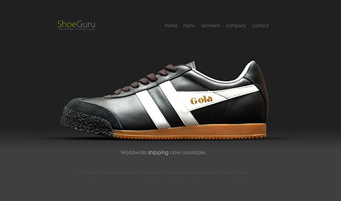
Want to encourage better conversion rates on your website (be it purchases, blog traffic, whatever) while looking good? Don’t give your readers more than a few options to choose from. By forcing them to look at what you want, you’ll enjoy more targeted traffic.
Apple does it. So does Shoe Guru. Both may be extreme, but their website design ensures them greater control over what they promote, resulting in tighter focus and better sales over the alternative, cluttered sites.
Off-topic: I’d totally buy those shoes if knew what Shoe Guru size I wear.