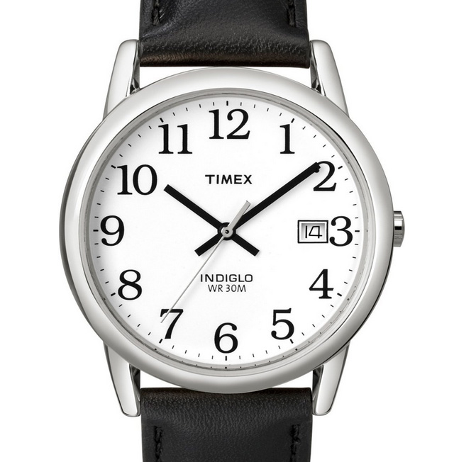
The Timex easy reader is the best watch I’ve ever owned. The reason: The clock typography is perfectly weighted, sized, and immediately recognizable. You might say a watch is just a watch, or that the time it takes to discern one analog clock from another is immaterial.
It’s not.
After using my smoking hot Puma watch for a year, the milliseconds gained in using the Easy Reader is noticeable. Not enough to lengthen my day. But from a user experience, it just feels right.
I’ll still reach for my Puma for style and casual reasons. But for everything else, I prefer the Easy Reader. Know what font it is by chance? It looks like its from the Bookman family, but I haven’t found an exact match.
I finished reading Designing With Type over the weekend. In addition to providing useful tips, the resource book reminded me of type design techniques that I loath, which include (but are not limited to) the following:
- Double spacing after a period. I don’t care what your fifth-grade teacher taught you: never ever double space after a period. Thanks to improved technology, we don’t have to jerry-rig sentence spacing like typewriters did. One space suffices.
- Underlining. Another antiquity from the typewriter days, underlining is a manual technique copywriters used to emphasis a word or sentence by returning to a previously typed section and underlining it with the underscore character (_). There’s no longer any use for it, even in web links (because we have color links). Use italics, a quieter, more readable alternative to highlighting. But use them sparingly, please — like once or twice max for any given document. Continue reading…

