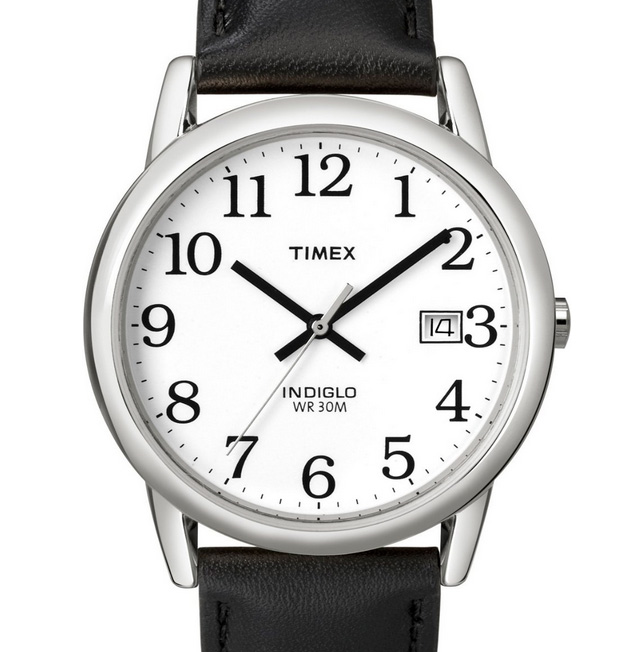
The Timex easy reader is the best watch I’ve ever owned. The reason: The clock typography is perfectly weighted, sized, and immediately recognizable. You might say a watch is just a watch, or that the time it takes to discern one analog clock from another is immaterial.
It’s not.
After using my smoking hot Puma watch for a year, the milliseconds gained in using the Easy Reader is noticeable. Not enough to lengthen my day. But from a user experience, it just feels right.
I’ll still reach for my Puma for style and casual reasons. But for everything else, I prefer the Easy Reader. Know what font it is by chance? It looks like its from the Bookman family, but I haven’t found an exact match.
I received the below reader email Thursday, inquiring about the best way to highlight text within a paragraph.
I’m a design student working on a book layout and wanted to add some texture to my text, but not if it impedes readability. One of your articles deplored in-line bolding, but what about italicizing? And if that’s acceptable, are the commas, quotation marks, and the speaker’s name (“______,” says Mr. X, “_______.”) also italicized? — Jo
Thanks for reaching out, Jo. I’m in no way the authority on typography design, but I don’t think italics are the readable friendly design answer. Continue reading…
I finished reading Designing With Type over the weekend. In addition to providing useful tips, the resource book reminded me of type design techniques that I loath, which include (but are not limited to) the following:
- Double spacing after a period. I don’t care what your fifth-grade teacher taught you: never ever double space after a period. Thanks to improved technology, we don’t have to jerry-rig sentence spacing like typewriters did. One space suffices.
- Underlining. Another antiquity from the typewriter days, underlining is a manual technique copywriters used to emphasis a word or sentence by returning to a previously typed section and underlining it with the underscore character (_). There’s no longer any use for it, even in web links (because we have color links). Use italics, a quieter, more readable alternative to highlighting. But use them sparingly, please — like once or twice max for any given document. Continue reading…
Speaking of typography, the introduction to Designing with Type provides an important lesson for anyone using copy to produce a word document, which is everyone these days.
“Technology has not changed how we read. There are twenty-six letters and we still read them from left to right, one line at a time. So while typesetting methods, typeface designs, and fashions in typography layout may continue to evolve, we must never lose sight of two facts: type is still meant to be read, and typography, by its very nature, is a conservative art.”
When it comes to designing with fonts, readability is paramount. For anyone still using heavy amounts of 10 point tiny text because “it looks cleaner,” you’re stuck in the past (circa 1999-2001 to be exact).
I’ve blogged about Helvetica before (my review here), and now that the documentary is posted in its entirety on Google Video, there’s really no reason for anyone not to see it. Get that!

It’s documentary week here at Smooth Harold, and this is one I’ve been wanting to see since it first premiered in NYC in March. It’s called Helvetica, and it’s all about type and design.
Here’s a snippet from Kottke’s 4/5 star review: “Perhaps the highest praise I can offer for Helvetica comes courtesy of [my wife], who was snickering on the way into the theater about going to see a movie about a font and exited saying, ‘that was great, now I want to be a designer!’ The rest of the audience, mostly designers and type folks, loved it as well. But for the non-design folks, what’s compelling about the movie is getting a glimpse of how designers think and work; that it’s not just about making things look pretty.”
Unfortunately, I’ll have to wait until it hits DVD as the film is only showing on the artsy fartsy coasts. Any one else seen it?


