Smooth Harold mailbag: Italicizing quotes?
I received the below reader email Thursday, inquiring about the best way to highlight text within a paragraph.
I’m a design student working on a book layout and wanted to add some texture to my text, but not if it impedes readability. One of your articles deplored in-line bolding, but what about italicizing? And if that’s acceptable, are the commas, quotation marks, and the speaker’s name (“______,” says Mr. X, “_______.”) also italicized? — Jo
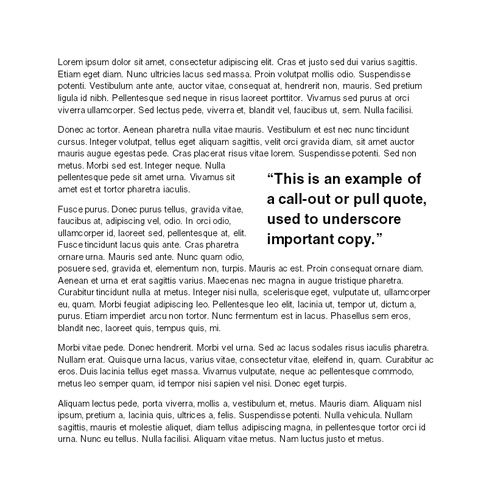
Thanks for reaching out, Jo. I’m in no way the authority on typography design, but I don’t think italics are the readable friendly design answer. Why don’t you use a call-out (also called a pull quote)?

That way you can ensure consistent type in the meat of your copy, and still highlight important parts for the reader. For even more texture, try a drop cap.
3 Comments
In legal writing, you see a lot of block quotes. See http://en.wikipedia.org/wiki/Block_quote. That said, I don’t think that block quotes are a good way to provide emphasis. Generally, people just skim over them (if they read them at all).
I disagree that italics are improperly used to emphasize words or phrases. If anything, people need to stop using bold and underlining to emphasize. Italicization is certainly preferred. My recommendation is to italicize only the words within the quotation marks and not the quotation marks themselves. Italicized quotation marks just look funny.
If possible, only emphasize part of the quoted material: “For example, I hope that this emphasis, is what stands out in this quote.” While I’m rattling off my wish list, I also wish that the U.S. would follow Britain’s lead and start putting punctuation marks that are not part of the quoted material after the closing quotation mark.
Thanks, Blake! I appreciate your putting this matter out there and your thoughts on it. I’ll try that with my spreads and see where it takes me.

Italicizing text is terrible for usability! Terrible! Sadly, the organization I work for italicizes copy too often, and I’m not in the position to change it all. 🙁
I do know, though, that usability research indicates that italicizing text is not the way to go, if you want your information to be accessible to all users. The best way to emphasize a portion of text is by chunking properly and calling out text like you suggested, Blake.
No italics!