Smooth Harold reader Tod from Nashville emailed this last week:
I’ve just started to enjoy your website. I was wondering if you have (or would consider adding) an “archives” link that shows the title of each post you’ve done. It seems like you have a lot of content. A feature like this would allow your users to find articles of interest more quickly in a browsing fashion. I did notice that you have an archives section by month that includes the content, but I’m referring to more a list of titles.
Here you go, Tod. Thanks for whipping my usability into shape.

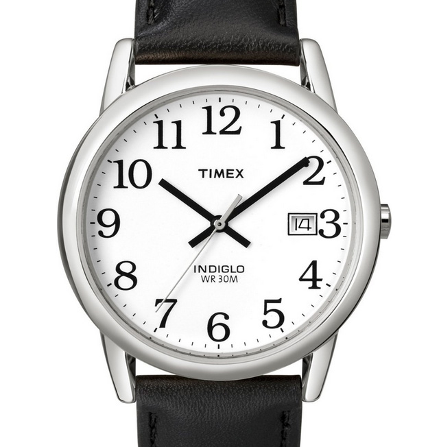
The Timex easy reader is the best watch I’ve ever owned. The reason: The clock typography is perfectly weighted, sized, and immediately recognizable. You might say a watch is just a watch, or that the time it takes to discern one analog clock from another is immaterial.
It’s not.
After using my smoking hot Puma watch for a year, the milliseconds gained in using the Easy Reader is noticeable. Not enough to lengthen my day. But from a user experience, it just feels right.
I’ll still reach for my Puma for style and casual reasons. But for everything else, I prefer the Easy Reader. Know what font it is by chance? It looks like its from the Bookman family, but I haven’t found an exact match.
Steve Krug argues in his book Don’t Make Me Think! that a good program or product should let users accomplish their intended tasks as easily and directly as possible. The less time it takes a person to complete a desired task (even if only by a few seconds), the more satisfying it becomes. When that happens, people are more likely to use a product in greater frequency and return for more. So in the spirit of improved usability, here are ten standard features every videogame designer should embrace.
Continue reading at Business Week…
Everyone and their dog says “mischEEvious” not “mIschievous.” So should the spelling be changed to reflect widespread American use, or is that English heresy?
One of the things the new Griffio website is lacking, outside of the all important content that is coming soon, is footer paragraphs. Footer paragraphs are a great way to increase your website’s usability, user goals, and traffic via SEO juice. Take this one for example that I use on a fan site I publish:
“Infendo is a gaming blog for gamers passionate about all things Nintendo. The site covers news, tips, cheats, rumors, speculation, reviews, culture, Wii, DS, GameCube, Game Boy Advance and a whole bunch more several times daily. Subscribe to our RSS feed, listen to Infendo Radio — the number one Nintendo podcast on the internet — or send us a tip! Infendo. Always informed.”
As you can see, the footer copy serves as a site summary and a call to action featured at the bottom of every page on the site. It’s keyword rich, it makes sense to humans, and encourages them to further interact with the site in a way we desire. Will your site see an explosion of traffic after implementing such an idea? Probably not. But it’s better than the alternative as analytics prove. White space and a bland copyright statement in your footer is a waste of space despite their clean looks. People like suggestions when reaching the end of content. Make sure you give it to them with well written, key word rich, and action-encouraging footer paragraphs. I promise you’ll see results, however small.
[Thanks, Nicholas]

