[youtube]https://www.youtube.com/watch?v=Jv5StAv77Dg[/youtube]
Arby’s has the meats, they have Pepsi, and they have subtlety. This is powerful advertising, enough to make a non-fan like myself spread the word. That and Ving Rhames’ voice is spellbinding.
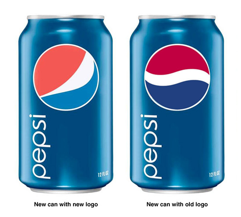
At the very least, the team responsible for making the hideous new logo look like a Pepsi-fied version of Strong Sad. Why didn’t the company just refresh their packaging without the logo change? The new cans, and even the “Pepsi” logotype, look slick — I’ll give them that — but they would’ve looked much better with the original, classic logo. Here’s a mock-up I made to prove the point. But what do I care: Coke tastes way better, no?
See also: YouTube: The rebranding of Pepsi
