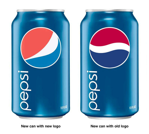
Pepsi should fire their creative agency. Here’s proof.

At the very least, the team responsible for making the hideous new logo look like a Pepsi-fied version of Strong Sad. Why didn’t the company just refresh their packaging without the logo change? The new cans, and even the “Pepsi” logotype, look slick — I’ll give them that — but they would’ve looked much better with the original, classic logo. Here’s a mock-up I made to prove the point. But what do I care: Coke tastes way better, no?
See also: YouTube: The rebranding of Pepsi
17 Comments
Looks like the Obama logo to me.
The mockup says it all … I think over time this will go down as one of the worse logo decisions ever.
By the way, is it more or has anyone else noticed a plethora of corporate slip ups during this recession. (Yes, I’m counting Pepsi’s dumb logo as one.)
Did you see this over at Rosscott’s site?
http://www.notquitewrong.com/rosscottinc/2009/02/12/new-pepsi-logo/
Ten points for the Homestar reference. Even flat Coca-Cola is better than Pepsi.
Blake,
No doubt I like the old logo better. The new logo looks like Pepsi inserted a warped mirror image of the Nike swoosh. The swoosh and similar symbols have become increasingly popular as part of company and product logos over the past number of years. I suppose the swoosh often gives an appearance of sportiness, but Pepsi failed in that regard. As to Coke vs. Pepsi, I have my moments for each. I love Coke Zero (the commercials about Coke Zero suing Coke for taste infringement are hilarious), but lately I find myself reverting to Pepsi despite the bad branding.
-Perry C.
Tropicana is also having rebranding pains. So much so, in fact, that they’re dropping their new branding. I’m counting that as more evidence that a recession is the worst time possible to rebrand. (Note: you should be focusing on lowering costs. If you can cut costs and raise profits … you’ll hit a gold mine.)
It looks like the logo of a cheap hotel in Puerto Vallarta. Welcome to the Palmas Paraiso!!!
You are wrong. pepsi is better.
Pepsi is and always will be the best.
I got an idea how about if we replace the one from the Diet pepsi logo so it will look slimmer than the fat one same with pepsi Max.
That new logo reminds me of one that I remember seeing when I was much, much younger. I think the colors were different then, green an brown or maybe just different shades of green. But the design itself looks like one I remember either belonging to the “Campfire Girls” or the “Girl Scouts”. It just seems to me that one of them was using a logo almost exactly like that.
Maybe logos have gone the way of Hollywood movies? If the first one is successful there are half a dozen knock-offs within 6 months.
When I give presentations on the power of trademarks, I always use the old Pepsi logo (mixed with a number of other famous logos. Every time someone makes a comment about the new Pepsi blob logo. Not only should the can their creative agency, the should can whoever in the company eventually signed off on it.
it looks stupid but the E in PEPSI looks like the old logo so why change it anyway so it dosnt match?
it does’nt matter what the logo looks like we have 2 drink the cola not it’s logo………;)
The typeface on the right one should say PEPSI though. Then its perfect.
I’d see all kinds of ads about blogging on the Internet to earn money, but don’t know of anybody that has actually made any money this way. I’d love to hear from anybody who has..

Blake, your last sentence says it all. Coke’s taste always was, is, and will be better than Pepsi’s! Viva La Coca!