 As seen in this month’s issue of Wired.
My thoughts: Agreed that information technology isn’t always replaced by newer technology (i.e. pens, pencils, paperbacks). But to suggest that printed magazines are actually thriving is a bit of stretch. My guess is the quoted “11 percent growth” stems from that fuzzy “pass along” metric magazines still use to measure audience size. (And to suggest that magazines are the superior way of reading essays is also wrong.)
Either way, stop hard-selling yourself, magazines. We know what you’re good for: Bathrooms, waiting lobbies, and other offline environments.

I have no idea.
By the looks of the cover, it seems this magazine is peddling comics, and not playable computer graphics, more commonly known as video games.
In other words, “concept art” is lame, and does absolutely nothing for me. Is it any wonder this medium is struggling?
The July 2008 issue of Transworld Skateboarding has seemingly set a new world record for a magazine: 37 back-to-back full-page ads. I’m not kidding. The format looks something like this:
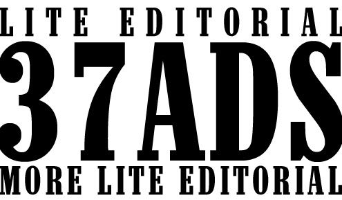
The feat makes Wired Magazine’s ad-filled issues look tame. Worse still, Transworld editorial is shallow for the most part. I subscribed to the magazine because I think flying skateboarders look cool, but I’m disappointed with my subscritption so far.
Economist.com — “Pick almost any American newspaper company and you can tell a similar story. The ABC reported that for the 530 biggest dailies, average circulation in the past six months was 3.6% lower than in the same period a year earlier; for Sunday papers, it was 4.6% lower. Ad revenues are plunging across the board…”
Fact: many technologists were quick to predict the death of pen and paper with the rise of typewriters and personal computers. Similarly, many technologists predicted book sales would decrease with the rise of e-book readers.
That being said, older technology can often persist in light of new technology through adaptation (i.e. new technology does not always obviate older technology). I believe the same is true for newspapers and magazines, provided they accentuate their remaining value (portable text, reputation, local community, and/or more non-ephemeral reporting like features).
[via Digg]
Click for enlarged image. As featured in the March 2007 issue of Connect Magazine (a local trade magazine). Now let’s see if I wasted my money… Whatd’ya think?
Connect Magazine has a fairly new ad campaign aimed at soliciting user-generated feedback from its readers. The campaign shows close-ups of several individuals (some prominent) with the quoted text, “I’m Editor-in-Chief,” suggesting that anyone can make recommendations for improvement. That’s a good thing. So it is in this public forum and with the utmost respect that I offer the following two suggestions after reading the first article from the magazine’s January issue (Nota bene: The online version only contains half of the print formatting problems I’ll discuss below):
-
Reference yourself as a proper noun. As you’ll see on both the online and print versions of Connect Magazine, the publication always references itself in-paragraph as “connect” sans capitalizing the “c” despite their being a proper noun. The reason — I suspect — is because the publication uses all lowercase letters in their logotype like several other companies do including my own. But the war waged against uppercase proper nouns in writing will never be won. Rather, the attempt in creating an exception to the rule is confusing to readers, and frankly, looks amateurish; like something a brash mom-and-pop shop would do shortly after creating their first company name. People don’t expect proper English on a creative logo, but they do expect it when reading copy. So ditch the lowercase “c” at the paragraph level if you want to mitigate confusion.
-
Quit changing the font type, its size, or its color in-paragraph. In paper form, Connect now uses a bright orange (its corporate color) when referencing itself or its URL in addition to snubbing conventional proper nouns. It also appears that they change the font type and its size a bit. This issue is largely more problematic that the first. It significantly reduces the readability by disrupting text continuity. The overall reading experience feels like that of driving your car over those annoying speed bumps in front of elementary schools. I’m betting the magazine did this in a vane attempt to combat the reader confusion cited above, which — if accurately assumed — would be ridiculous. And no, just because online articles can get away with colored hyperlinking doesn’t mean you can in print form. You’re a magazine not a website!
The above two suggestions are sure to increase the professionalism, usability, and most importantly, the readability of an already excellent publication. After all, Connect sells reading material for a living. They’d be wise not to alienate that experience for creativity’s sake or ambitious differentiation.
Disclosure: I write for Connect.

