
Helvetica (the film) tells a colorful story
I finally saw Helvetica on DVD last night with my non-designy wife. Some thoughts:
- Designers are some of the most passionate people on earth. Who knew such strong feelings could be shared on the world’s most widely used font, Helvetica (Arial being the PC ripoff).
- The documentary itself is beautifully done. Very nice cinematography.
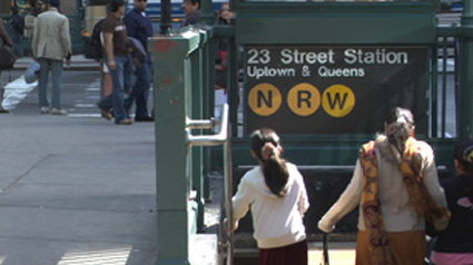
- Helvetica is EVERYWHERE. I knew it was ubiquitous before, but you’ll be amazed how often the font is used in everyday life and corporate identity.
- Helvetica is unthinkably diverse. It can be bland, starchy, and cryptic, or hip, cheeky, and modern.
- The movie is more about design and typography than it is about a single font — it just uses The Swiss Font to tell the story.
- Helvetica was created to obviate the messy design of the fifties. It was prominent throughout the seventies until rebel designers revolted and got ugly again. New designers have since returned to the clean, universal font. We’ve come full circle, and perhaps have done all that we can in creating fonts.
- I like the Max Miedinger-created type, but rarely use it in my design projects. I’m too amateur to pull it off opting instead for fonts that have a little more character (but not too much).
- I believe fonts should be legible first and foremost. Their purpose is to convey language, not interpret it.
Good film. Three and a half stars out of four.
Helvetica [official site]