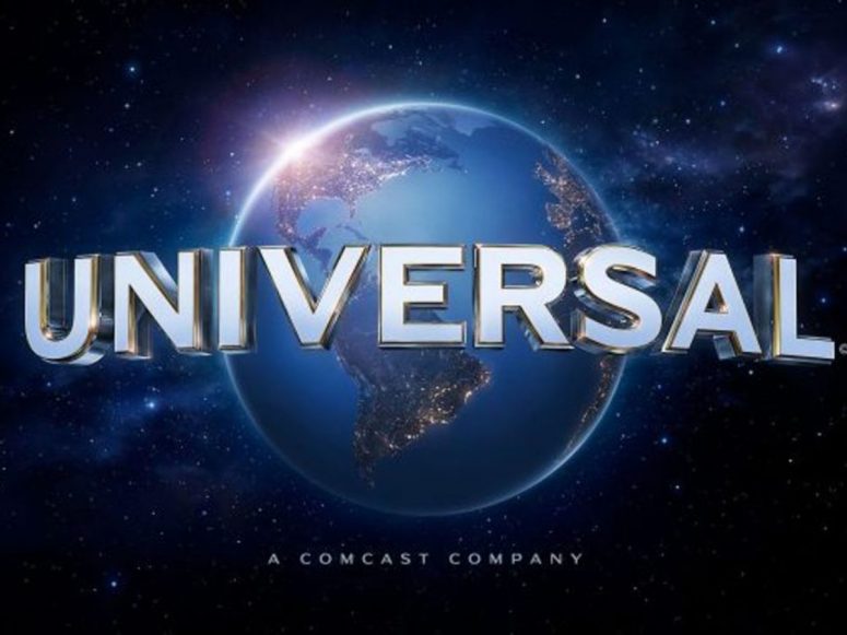
After music, I spend a lot of free time watching movies. Because Hollywood’s “big five” movie studios produce 90% of all major films, I see the following logos a lot. Most of us do. While every major studio makes great movies, these are my favorite intro logos (or title cards” in cinema-speak) ranked from best to worst:
- Universal Pictures. The oldest major (and second biggest) movie studio title card is also the best. It builds suspense, has the best fanfare music, is booming with bass, and just looks awesome. I love it.
- 20th Century Studios (owned by Disney). Another classic with perfect panning, motion, and music. Not as epic as Universal, but close.
- Walt Disney Pictures. I would have put Warner Bros. ahead of Disney here, but since the former recently changed their logo to something that looks more like a TV logo, Disney Pictures takes the third spot. It’s the most fantastic, if not busiest, one and brings out the inner kid in me.
- Warner Bros. Pictures. The older, darker Warner Bros. logo was much better in my opinion. But this new, brighter title card still pays homage to Hollywood’s largest physical studio. Great music too.
- Paramount Pictures. I really like the flying stars and soaring peak that was purportedly pattered after Pfeifferhorn mountain in my native Utah. But the music is even more boring than Columbia. For this, the logo of the biggest movie studio takes the fourth spot.
- Columbia Pictures (owned by Sony). I love Columbia (the mascot for America) but this logo doesn’t move me at all. Still seems dated and boring. At least they made Karate Kid and all those terrific Tarantino films.
This tiny house which was converted from a garage. Photos here.
When Lindsey and I send off all the kids, I’d consider living in something similar, only with slightly bigger commons area for the grandkids.
As for overnight guests, they can get a hotel. 🙂
 See also: Logo redesign done wrong: Pepsi

Although I’ve been bored with NASA since the ’80s, this commemorative logo, released in 2008, looks slick.
 As this report so eloquently states, media is still best consumed with a mouse and keyboard, passive video, or with opposing hands leafing through pages of information. “Interactive media” as seen on the iPad is as useful as “multimedia CD-ROM dictionaries” from the 1990s, m’kay?
Now if you’re talking about entertainment, I’m all for gesture based interaction. But for straight consumption of information, give me visual ads, easy flowing editorial, and search.
")
The black coloring makes them look more discreet than they really are. When seen in-person, it’s as if I’m wearing ballerina slippers. (Ridiculous!) Nevertheless, I’m excited to review what’s been called the “next best thing to barefooting” on my daily runs—no heel crashing allowed. Wait for it.

Dateline: July 2004. By the color you would think I was selling hamburgers. By the home page copy you would have wondered, “what the crap does this guy do?” And by the cryptic stock photography, you would have thought I was either a motivation speaker or Chinese rice farmer—not a web designer, like I was at the time. Plus it had about eight too many pages. Funny how the look represents everything I currently despise about design (broad ambiguity). Incredible it was only five years ago. At least I had the insight to bet big on open source!
I received the below reader email Thursday, inquiring about the best way to highlight text within a paragraph.
I’m a design student working on a book layout and wanted to add some texture to my text, but not if it impedes readability. One of your articles deplored in-line bolding, but what about italicizing? And if that’s acceptable, are the commas, quotation marks, and the speaker’s name (“______,” says Mr. X, “_______.”) also italicized? — Jo
Thanks for reaching out, Jo. I’m in no way the authority on typography design, but I don’t think italics are the readable friendly design answer. Continue reading…
I finished reading Designing With Type over the weekend. In addition to providing useful tips, the resource book reminded me of type design techniques that I loath, which include (but are not limited to) the following:
- Double spacing after a period. I don’t care what your fifth-grade teacher taught you: never ever double space after a period. Thanks to improved technology, we don’t have to jerry-rig sentence spacing like typewriters did. One space suffices.
- Underlining. Another antiquity from the typewriter days, underlining is a manual technique copywriters used to emphasis a word or sentence by returning to a previously typed section and underlining it with the underscore character (_). There’s no longer any use for it, even in web links (because we have color links). Use italics, a quieter, more readable alternative to highlighting. But use them sparingly, please — like once or twice max for any given document. Continue reading…
Speaking of typography, the introduction to Designing with Type provides an important lesson for anyone using copy to produce a word document, which is everyone these days.
“Technology has not changed how we read. There are twenty-six letters and we still read them from left to right, one line at a time. So while typesetting methods, typeface designs, and fashions in typography layout may continue to evolve, we must never lose sight of two facts: type is still meant to be read, and typography, by its very nature, is a conservative art.”
When it comes to designing with fonts, readability is paramount. For anyone still using heavy amounts of 10 point tiny text because “it looks cleaner,” you’re stuck in the past (circa 1999-2001 to be exact).
[youtube]http://www.youtube.com/watch?v=kU9YeOQm3Y0[/youtube]
From this video we learn two things:
- (Most) People are terrible designers
- (Most) Designers have no balls. Rather, they collectively pander to client requests instead of imposing their professional will on customers much like a doctor or mechanic would. This is a disservice to both the client and the designer — everybody loses.
[via Nick Roussos]

I’m actually okay with airbrushing from a design standpoint — to an extent. So long as you “clean up” blemishes, I’m fine with it. But I also believe mainstream designers have gone too far recently, especially when they start digitally thinning tubby individuals or make humans look more like plasticized wax than a living organism. The above photo illustration, by Jill Greenberg, is brilliant in its subject (to candidly capture toddlers crying), but her Photoshop hack job looks disturbingly awkward. Can we at least spare the children? This picture would have been so much better unadulterated.
I’ve blogged about Helvetica before (my review here), and now that the documentary is posted in its entirety on Google Video, there’s really no reason for anyone not to see it. Get that!
Steve Krug argues in his book Don’t Make Me Think! that a good program or product should let users accomplish their intended tasks as easily and directly as possible. The less time it takes a person to complete a desired task (even if only by a few seconds), the more satisfying it becomes. When that happens, people are more likely to use a product in greater frequency and return for more. So in the spirit of improved usability, here are ten standard features every videogame designer should embrace.
Continue reading at Business Week…
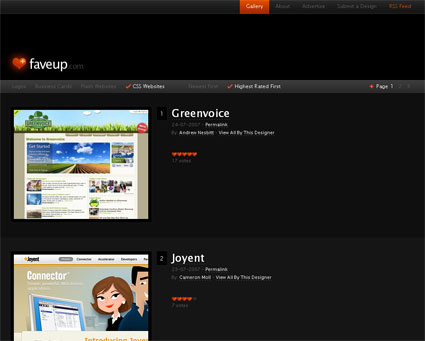
Faveup is a nifty little Digg-esque voting site for designers looking for inspiration. The site features logo, biz card, flash sites, and css site designs for the uninspired. Granted, some of the looks are trendy and Fisher Pricey, but overall, its a fresh take on the current state of design. Check it!
It’s documentary week here at Smooth Harold, and this is one I’ve been wanting to see since it first premiered in NYC in March. It’s called Helvetica, and it’s all about type and design.
Here’s a snippet from Kottke’s 4/5 star review: “Perhaps the highest praise I can offer for Helvetica comes courtesy of [my wife], who was snickering on the way into the theater about going to see a movie about a font and exited saying, ‘that was great, now I want to be a designer!’ The rest of the audience, mostly designers and type folks, loved it as well. But for the non-design folks, what’s compelling about the movie is getting a glimpse of how designers think and work; that it’s not just about making things look pretty.”
Unfortunately, I’ll have to wait until it hits DVD as the film is only showing on the artsy fartsy coasts. Any one else seen it?

This, my friends, is how you want to vacation on St. Maartens… With a ginormous metal tube flying 40 feet above your head every 15 minutes as you try to relax on the beach. No, that’s not photoshoped. Other amazing photos of the civil engineering atrocity can be seen here.
[via Kottke]
I had a recent conversation with a colleague of mine who was asking about good design, specifically for websites. Here’s what I told him:
“Don’t try to make a website look good. Ensure that it doesn’t look cheap and that it wouldn’t hurt an audience from further viewing it. There’s a difference. By focusing on not making [a site] look bad, it will naturally look good.”
Over the past five years, that has always been my approach, and it has been a very successful one for me. I’m not the best designer, but I do know how to make something look clean and professional which is what it should be doing anyway. A website is to content as a glass is to water. Don’t let the glass distract from the importance of the water.
See also: Intelligent Design (May 2005)
Too many people try to think outside of the box, especially when it comes to product design. I guess they think that being outside of the box will automatically classify their efforts as creative. This belief couldn’t be further from the truth. Good design doesn’t always require creativity. Innovation does. So I guess before starting to design a product you need to decide, “Am I’m designing or innovating?” Once you get that down, you’ll be much more successful with your creations.
A quick example of this might be if you were a shirt designer. You might decide to “design outside of the box” by moving the shirt pocket from the left side to the right. The shirt was already working fine though as shirt users expect the pocket to be on the left side. In this case, you wouldn’t reinvent the shirt, just redesign it to make it look better. Maybe try a new pattern or a different color, but don’t try to innovate the already functioning shirt. You have to consistently use common sense to achieve intelligent design.
Continue reading…
Some of you may like to know: exactly how does Griffio go about solving our clients’ business challenges? Well, we’ve loosely documented but rigidly followed the below ideology. (It applies to all sorts of problems and not just how to make web-based business software.)
-
Discover. Find out what the problem is. A lot of times, you can just ask, “What’s the problem?” or “How can I make your job easier?” Otherwise, conduct in-depth research, such as thorough exploration and investigation to expose the predicament.
-
Design. After you understand where the problem is, you need to think it through. What ways can you solve the issue? What would work best? Continued research must take place to test your ideas during this phase. Contrary to popular problem solving formulas, this is where most of the testing should take place. An example would be how a certain web page will work or how my audience would react to this idea. Try to uncover any potential hang-ups the idea or process may have.
-
Develop. Create or build the supporting materials. This step generally includes the use of technical tools such as a software editor, a hammer, or even written notes. Good craftsmanship must take place to ensure quality.
-
Deliver. Once the system or idea is built or completed, deliver it, launch it, present it, or sell it. This is the part where you give and/or tell the “problemee” what you think will best improve their current state.
-
Support. This is where you help implement you solution, be it an idea or website. Problem solving requires change, both logistical and behavioral. Good support facilitates that change. The audience should be free to ask questions or get training as to how to best use your idea.
Hopefully, this will help or add to how you approach problems. The idea is to use these steps or a derivative of them in solving just about anything. If you come up with any areas that this might not work (i.e. marriage) please let me know by filling out our quick and easy comment box.
